top of page


Beautiful U'
logo & brand concept
Beautiful U'
February 2016
The client approached me to design a logo and build a brand identity that would reflect their mission: to provide a sexier, more empowering alternative to traditional post-surgery undergarments. The goal was to help women feel like themselves again, strong, beautiful, and wholly feminine, through intentional design that celebrates resilience without sacrificing style.

.png)
Designing the brand
After meeting with the client and conducting in-depth research, I concluded that the Beautiful U logo had to convey elegance and resilience. I wanted the design to symbolize beauty, healing, and strength. As well as incorporating curves and a modern serif typeface to evoke femininity without feeling fragile.


The process began with hand-drawn sketches to explore form and feeling. Once the client selected a direction, I moved into refining the logo and identifying a color palette that aligned with the brand's tone of soft, empowering, and elegance.


Locking in the look
Once the final logo brand, and color palette were approved, the focus shifted to refinements and consistency. The selected mark was fine-tuned for balance, scalability, and clarity across digital and print. The color system rooted in soft neutrals and muted tones was developed to evoke calm, trust, and empowerment. Typography, spacing, and supporting brand elements were also defined to ensure a cohesive visual identity across all touchpoints.
The business card was the first piece we designed using the final logo and brand direction, setting the tone for the rest of the identity.
Business card layout
-
Standard business card
-
Paper stock: 16pt gloss coat, UV
-
Front: Spot UV
-
Back: full color
-
Coating: Gloss
-
Radius corners: 0.125" / 3.175 mm


Visual direction planning
To establish a cohesive and intentional brand identity, we began by defining the emotional and visual tone of Beautiful U. Soft textures, muted colors, and refined typography were selected to convey healing elegance and quiet strength.


Each piece was an opportunity to make the brand feel personal, purposeful, and present in everyday life.
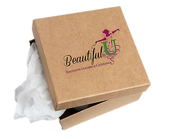
As we shaped the brand, we extended the visual identity beyond the logo into thoughtful, tactile touchpoints. Sales tags were designed with minimalist elegance featuring soft tones, delicate type, and messaging that affirms self-worth. Apparel like branded shirts carried subtle affirmations and the logo mark, blending wearability with quiet advocacy. Coffee cups offered a gentle moment of self-care, wrapped in warm hues. Packaging was kept clean and calming, using eco-conscious materials and understanding design to reflect both sustainability and softness.
Project overview
Title: Beautiful U', Breast Cancer Apparel System Client: Beautiful U'
Industry: Breast Cancer Awareness - CSR Apparel and Consumer Products
Duration: December 2015 - February 2016
Role(s): Brand Identity System, Creative Director, Visual Identity Lead, Packaging Designer
Tool(s): Adobe Creative Suite, Figma, Paper & Pencil, Research
bottom of page