


PetSpace
UX responsive Website
Google UX Certification
August 2022
A nonprofit initiative dedicated to rescuing and advocating for stray animals. This project, developed as part of my Google UX Design Certification, focused on building a compassionate and accessible digital platform that raises awareness, inspires community involvement, and supports animal welfare efforts.

PetSpace:
Designing a Compassionate Digital Experience
A responsive website created as part of the Google UX Design Certification, focused on building an accessible, user-centered platform that inspires adoptions, drives donations, and fosters community involvement in animal welfare.

The Challenge / Problem
PetSpace’s existing website failed to deliver a seamless or engaging user experience across devices. Users reported difficulties navigating the site, which created barriers when trying to complete critical tasks such as donating, adopting, or volunteering.
-
Navigation Challenges → The site lacked a clear, intuitive structure, leaving users frustrated and unsure of how to take action.
-
Weak Calls-to-Action → Donation and adoption flows were buried or unclear, reducing user engagement and limiting the impact of PetSpace’s mission.
-
Inconsistent Visual Identity → The outdated look and fragmented design language diminished trust and professionalism, making the nonprofit appear less credible.
-
Accessibility Gaps → With no adherence to accessibility guidelines, the experience excluded users with diverse needs, limiting reach and inclusivity.
-
Systemic Barriers → County shelters often face limited accountability and chronic underfunding, creating a gap in resources and services for stray animals. This left nonprofits like PetSpace with a greater responsibility to advocate, educate, and provide alternatives—yet the website failed to reflect that urgency.
This combination of digital shortcomings and real-world systemic challenges created a disconnect between PetSpace’s mission-driven goals and the online experience. As a result, the website was not only limiting user action but also falling short in representing the broader advocacy role PetSpace plays in addressing shelter shortcomings and funding gaps.


Research & Discovery
To address the website’s usability issues and reflect PetSpace’s advocacy mission, I conducted a research-driven approach that combined user-centered insights with an understanding of the broader animal welfare landscape. This ensured that the design not only improved task completion but also communicated PetSpace’s role in addressing systemic gaps.
User Research
-
Surveys & Interviews: Engaged with adopters, donors, volunteers, and community members to understand motivations, frustrations, and expectations.
-
Usability Audit: Evaluated the old site’s navigation, adoption and donation flows, and mobile performance to identify points of friction.
-
Shelter System Insights: Researched local county shelters and nonprofit networks, uncovering limited funding, lack of accountability, and inadequate digital presence. These challenges reinforced the need for PetSpace to act as a reliable, accessible alternative for the community.

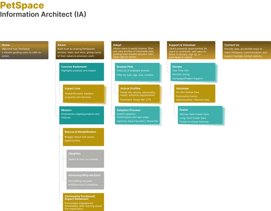

UX Strategy & Information Architecture (IA)
For PetSpace’s responsive website, the UX strategy was grounded in creating a seamless, mission-driven experience that encourages users to adopt, donate, or get involved from any device. The design goals prioritized clear navigation pathways, ensuring that visitors could easily find adoption listings, complete a donation, or learn how to volunteer without confusion. Responsiveness was essential, so layouts were crafted to adapt fluidly from desktop to tablet to mobile, ensuring task completion in any context.
To better reflect PetSpace’s advocacy role, the information architecture was restructured to group content by intent: Adopt, Donate, Get Involved, and About. This clarified user flows and minimized friction, particularly for donation and adoption funnels that previously were buried. Accessibility was built into the strategy with compliance to WCAG 2.1 AA standards, creating a more inclusive platform that welcomed diverse users.
The design process followed an iterative wireframing approach, starting with low-fidelity sketches to map structure and priorities, advancing to mid-fidelity prototypes tested with real users. Feedback informed refinements to the navigation hierarchy, ensuring the IA aligned with both user needs and PetSpace’s mission to advocate for animals.
Key Insights
-
Users wanted emotional storytelling paired with clear, actionable pathways.
-
The website needed to balance compassion and visual storytelling with task efficiency.
-
Accessibility and mobile-first responsiveness were critical to ensure inclusivity and reach.
-
Highlighting PetSpace’s role in bridging shelter gaps and advocating for animals was essential to inspire user trust and action.
Visual Design System (Graphics + UI)
The visual design system for PetSpace was created to balance emotional connection with usability, ensuring the interface felt both compassionate and professional. A warm, approachable color palette was chosen—earth tones and soft neutrals complemented by an accent color for calls-to-action—reflecting trust and empathy while drawing attention to critical tasks like adopting or donating. Typography paired a friendly, legible sans serif for body text with a slightly more expressive header font to maintain readability across devices while reinforcing brand personality.

Full PetSpace Color Palette
The full color palette was chosen to reflect the organization's mission of compassion, trust, and renewal.
Each color plays a distinct emotional role within the brand system:
-
Whisper Whisper provides a soft, calm foundation — symbolizing peace and safety.
-
Healing Paw and Safe Haven evoke care, balance, and emotional support, representing recovery and the comfort of protection.
-
Sunbeam Hope adds optimism and warmth, reminding users of every animal’s second chance.
-
Companion Coat and Shelter Root ground the palette, reinforcing stability, reliability, and the deep bond between pets and people.

Extended Brand Palette
The extended Brand Palette expands PetSpace's visual voice across digital touchpoints such as social media, email campaigns, and promotional materials. These accent tones bring warmth, contrast, and flexibility, ensuring that each post, banner, or ad feels connected to the core brand while adapting to different storytelling needs.

Primary Colors
The primary palette combines Golden Paw, Rescued Earth, Hopeful Sky, Soft Shelter, and Pure Heart to express warmth, compassion, and trust. These tones form the foundation of the website’s visual identity, creating a grounded yet inviting atmosphere that balances emotional storytelling with clear usability.
The warm orange highlights key interactive elements such as buttons, CTAs, and navigation prompts, guiding users toward meaningful actions like adoption or donation. Meanwhile, the rich brown and gentle neutral bring structure, readability, and calm, reflecting the safe, nurturing environment that PetSpace provides for every rescued animal, both on-screen and in real life.
Consistency was key to building trust, so a UI component library was developed, including buttons, cards, forms, and navigation elements that adapt fluidly across breakpoints. Iconography and imagery focused on rescued animals and community action, ensuring every visual touchpoint reinforced PetSpace’s mission. The system adhered to WCAG accessibility guidelines, using sufficient contrast, scalable fonts, and alt-text best practices to guarantee inclusivity. By combining these elements, the design system provided a cohesive digital identity, helping users engage more confidently with PetSpace’s platform.


Typography System
PetSpace’s typography system was designed to balance readability, warmth, and emotional resonance, ensuring every message feels approachable, trustworthy, and heartfelt. The primary typeface, Montserrat (in Semibold, Light, and Bold weights), establishes a clean, contemporary tone that aligns with the brand’s mission of compassion and care. Its geometric forms and open letter spacing enhance clarity and consistency across responsive layouts, allowing users to focus effortlessly on essential content such as adoption stories, donation prompts, and key calls to action.
To complement Montserrat’s modern structure, Adamina is introduced as a secondary or expressive font, used selectively for quotes, feature highlights, and emotionally driven storytelling moments. Its elegant serif form adds warmth and depth, reinforcing the human-centered side of PetSpace’s message and offering a subtle visual contrast that draws users into heartfelt narratives.


From a UX perspective, the typographic hierarchy supports visual flow, accessibility, and emotional engagement. Bold headlines anchor attention and establish rhythm, while lighter weights maintain readability across both desktop and mobile experiences. Strategic spacing, consistent line height, and thoughtful contrast ensure clear legibility against PetSpace’s warm brand palette, particularly tones like Golden Paw (#E67E22) and Sunbeam Hope (#C5A500). Together, Montserrat and Adamina form a unified voice, guiding users intuitively through the journey, while expressing both structure and soul in every interaction.
By pairing Adamina’s expressive elegance with Montserrat’s modern clarity, PetSpace achieves a typographic system that balances usability and emotion, ensuring each story, message, and call to action feels authentic, accessible, and heartfelt.


Logo Design
Overview
PetSpace is a personal nonprofit initiative I founded to protect and improve the lives of pets and stray animals through rescue, rehabilitation, and advocacy. As both the designer and founder, I set out to create a visual identity that would capture the compassion, trust, and community spirit at the core of the mission. The result is a brand system that feels approachable yet professional, one that can grow alongside the organization.
The design process began with extensive research into animal welfare organizations and community-based nonprofits to identify visual patterns and opportunities for differentiation. Early sketches explored concepts of unity, shelter, and compassion, using organic shapes and familiar animal silhouettes to evoke comfort and trust. Through several iterations, the heart and paw motif emerged as the central idea, symbolizing the love and protection PetSpace offers to every animal it helps.
Each variation retained the same visual DNA, characterized by rounded edges, balanced proportions, and a modern yet compassionate tone, ensuring brand continuity across all mediums. The color palette and typography were also fine-tuned for flexibility: warm neutrals for print, vibrant accents for web, and clear monochrome versions for watermarking and community events.

Primary Concept
Design process
The process began with research and sketch exploration, identifying visual opportunities that would distinguish PetSpace from other animal welfare organizations. Initial sketches varied from abstract line forms to more literal pet silhouettes. Through iterative refinement, the logo evolved into a minimal yet expressive symbol that balances emotional warmth with structured simplicity.
After establishing the core mark, I developed a modular identity system. Since PetSpace operates under my personal DBA, flexibility was key, the logo needed to adapt to different platforms and purposes. I created:
-
A primary emblem for formal use (documents, presentations, and outreach materials)
-
A simplified icon optimized for social media and small-scale digital use
-
A wordmark version for clean, typographic applications like signage or apparel
Each version was refined to maintain visual harmony and clarity across various scales and formats.
Outcome
The final logo system delivers a unified yet flexible identity that communicates PetSpace’s purpose with sincerity and strength. Whether displayed on social media, community flyers, or event banners, the design maintains its emotional resonance and visual integrity.
Beyond a symbol, the PetSpace logo represents the heart of a mission,
one rooted in empathy, design thinking, and the belief that every animal deserves care, dignity, and a safe place to call home.

Responsive Website Design
Overview
Following the logo development, the next step was to translate the PetSpace identity into a digital experience that could inform, inspire, and mobilize visitors. The goal was to design a responsive website that not only showcased the mission but also built trust and encouraged community participation — from donations to volunteer sign-ups.
As a personal nonprofit DBA, it was important that the website reflect both professional credibility and authentic compassion, bridging the emotional and practical sides of animal welfare advocacy.

Challenge
The responsive framework ensures a seamless experience across desktop, tablet, and mobile. Whether users are viewing rescue stories, submitting adoption inquiries, or donating online, the interface adapts fluidly to maintain readability, hierarchy, and engagement.
PetSpace needed an online presence that balanced heart and functionality. The challenge was to communicate warmth and care while structuring the site to support tangible actions like fostering, donating, and adopting. Additionally, the design had to perform across multiple platforms, from desktop browsing to mobile engagement, without losing visual clarity or emotional tone.


Wireframe & UX Structure
The wireframing stage was essential in defining the user experience and content hierarchy for the PetSpace website. Because the nonprofit serves multiple audiences, from potential adopters and donors to volunteers and community partners, it was crucial to create a structure that prioritized both emotional storytelling and ease of navigation.
The objective was to balance mission-driven content (stories, values, calls to action) with practical functionality (forms, resources, and responsive layout). Each wireframe focused on guiding users through a journey of awareness, empathy, and engagement, leading them naturally toward taking action.


UX Strategy
Before designing the visual interface, I mapped key user paths to understand how visitors would interact with the site based on their intent:
-
Adopters: Searching for available animals or learning about the adoption process
-
Donors: Looking for transparent impact stories and easy donation access
-
Volunteers & Partners: Exploring how to contribute time, skills, or resources
This research informed a clear, modular layout that supports storytelling while maintaining functionality. The homepage introduces the brand mission, while secondary pages are organized for quick scanning and seamless transitions between sections.


Wireframe Development
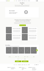
Low-fidelity wireframes were first created to test information hierarchy and flow without visual distractions. The layouts emphasized:
-
A prominent hero section with mission statement and call-to-action
-
Simplified navigation bar and mobile hamburger menu for intuitive access
-
Card-based content blocks for adoptable pets, success stories, and initiatives
-
Dedicated donation and volunteer panels positioned for maximum visibility
-
Footer with quick links and social icons for community engagement


High-Fidelity Prototype & UI Translation
Building upon the approved wireframes, the high-fidelity prototype phase focused on translating PetSpace’s compassionate brand identity into a fully interactive, responsive interface. The goal was to bring the wireframes to life with purposeful color, typography, imagery, and motion, creating a digital environment that feels both emotionally engaging and intuitively navigable.


Each design decision in this phase was guided by the core principles of the PetSpace brand: empathy, clarity, and trust. The structural framework established during wireframing provided the foundation for layering in the visual identity, ensuring the interface retained both emotional warmth and functional integrity.
-
Color Palette: The warm neutrals and vibrant accent tones established in the logo phase were carefully applied to highlight key actions and emotional moments, such as donation buttons or rescue stories.
-
Typography: A friendly sans-serif family paired with soft line spacing improved legibility while reinforcing the brand’s approachable tone.
-
Imagery: High-quality animal portraits and candid rescue shots were selected to humanize the mission and evoke emotional connection without feeling overly sentimental.
-
UI Elements: Rounded buttons, soft shadows, and generous white space mirrored the logo’s balance between care and professionalism.

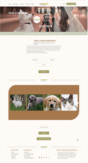

Once we layered in the colors, typography, and imagery, the whole thing started to feel alive. The design now captures the personality of PetSpace, caring, approachable, and community-driven, while staying true to its nonprofit roots.
Prototype Development
From there, I built an interactive prototype in Figma so we could see how everything worked in motion. This made it easy to test how the design performed across desktop, tablet, and mobile.
A few details that really helped the experience come together:
-
Smooth scrolling for a more natural story flow
-
Hover and tap effects that make the site feel interactive and responsive
-
Simple slide-ins for featured stories and pet profiles
-
A sticky navigation and easy-access footer to help users find what they need quickly


Interactive High-Fidelity Prototype
An interactive hi-fi prototype was created in Adobe XD to simulate real user interactions, allowing for early testing of navigation, visual hierarchy, and engagement across desktop and mobile.
The finished prototype blends storytelling with usability, giving PetSpace a digital presence that feels just as compassionate as its mission. The site is easy to use, emotionally engaging, and built to grow as the nonprofit expands.
What mattered most to me was designing more than just a site; I wanted to build a space that feels welcoming and purposeful. Every UX decision, from the emotional tone of the visuals to the simplicity of the user journey, was intentional. Visitors should feel both informed and empowered to act, to help, adopt, or share. That’s the kind of meaningful interaction I always aim to create.

Insight & Reflection
Designing for PetSpace was more than creating a brand; it was about shaping an emotional experience that connects people and animals through empathy and clarity. The process reinforced how thoughtful UX decisions, like pacing, hierarchy, and motion, can build trust and compassion just as much as visuals can. Every choice, from logo animation to interface flow, was rooted in accessibility, warmth, and purpose. The result is a digital space that not only informs and inspires but also feels like a safe haven, just like PetSpace itself.
Motion as a Human-Centered Experience System
Motion was designed to reinforce empathy, clarity, and trust across the PetSpace experience. Subtle animation and pacing were applied to guide attention, communicate care, and support emotional connection without overwhelming the user. By treating motion as a system, grounded in restraint, accessibility, and consistency, the experience remains calm, purposeful, and scalable across digital touchpoints, helping PetSpace communicate its mission with warmth and credibility.
