top of page


The Black Umbrella
logo design
The Black Umbrella
October 2018
The Black Umbrella is a podcast created by a group of Millennials, including my son, shortly after graduating college. Their vision was to build a bold, unfiltered platform for authentic conversations. The logo design reflects this mission—capturing the fearless voice of a Millennial generation while establishing a strong, marketable identity that resonates with their target audience.


Mood Boards:
Translating Insights into Design
Mood boards are more than collections of images, they are strategic tools that set the tone, spark inspiration, and align teams around a shared vision. In this project, mood boards were used to translate abstract concepts into tangible direction, bridging creativity and strategy.
By curating imagery, colors, and textures that reflect Millennial culture, I was able to capture their evolving tastes, emotions, and cultural influences. This process created a visual language that not only inspires but also resonates with the target audience on an emotional level.
The boards became a foundation for design decisions across branding, film aesthetics, and user experiences. They ensured every touchpoint felt authentic, relevant, and connected to Millennial values—making the brand identity both marketable and meaningful.
Impact
-
Established a clear creative direction grounded in user insights
-
Strengthened alignment between marketing goals and design execution
-
Built a framework for creating consistent, user-centered brand experiences
Decoding the millennial mind
Designing for Millennials means understanding more than just trends, it’s about creating authentic, intuitive, and visually compelling experiences that reflect their values. Through strategic use of color, typography, and storytelling, paired with user-centered design principles, we can craft brand identities and digital touchpoints that resonate with Millennial audiences, driving both engagement and long-term loyalty.
Challenge
Millennials represent a diverse and highly influential audience, but brands often struggle to connect with their values, digital habits, and desire for authenticity.
Design a visual and marketing strategy that resonates with Millennial culture, balancing bold creativity with relatability, while building trust and long-term brand loyalty.
Goal
Process
-
Research & Insights – Analyzed Millennial media consumption, design preferences, and cultural trends.
-
Visual Identity – Developed a fresh, modern aesthetic using bold typography, dynamic color palettes, and clean layouts that mirror their preference for authenticity and minimalism.
-
Messaging & Tone – Crafted copy that feels conversational, unfiltered, and transparent to reflect Millennial values.
-
Multi-Channel Strategy – Designed graphics and campaigns optimized for social media, podcasts, and digital platforms where Millennials engage most.
-
Engagement & Feedback – Integrated opportunities for interaction, community building, and co-creation to strengthen brand connection.


Concept Development & Exploration
Sketching provides a raw, unfiltered space for ideas to flow, allowing concepts to take shape before digital execution. For The Black Umbrella, starting with pencil and paper enabled rapid exploration, helping refine the brand’s essence while keeping the creative process fluid and intentional. Every curve, line, and composition was considered for its impact on readability, user engagement, and brand identity.
Typography played a central role in shaping the podcast’s voice. Bold, expressive letterforms were developed to mirror the unfiltered conversations at the heart of the brand. Cultural influences, from Millennial nostalgia to hip-hop aesthetics and digital-age rebellion, guided the process, ensuring the design resonates with the target audience while establishing a cohesive visual strategy across marketing and UX touchpoints.


From Concept to User-Centered Design
During the digital concept phase, I developed a range of design directions that balanced creative exploration with strategic brand alignment. Each concept was crafted to enhance recognition, engagement, and usability, giving the client multiple ways to visualize the brand’s personality while maintaining a cohesive identity.
I explored multiple design directions to balance creativity, brand strategy, and user experience. Refined options allowed the client to make informed decisions, resulting in a visually compelling, cohesive, and engagement-driven brand identity across all touchpoints.
Presenting refined options allowed the client to compare styles, color palettes, and layouts, ensuring the final choice captured their vision while supporting marketing objectives and user-centered design principles. This approach provided a clear, informed path to a cohesive brand presence that translates seamlessly across digital and physical touchpoints.


The selected logo embodies the brand’s identity, purpose, and vision, crafted specifically for a modern, Millennial-driven audience. Its balance of simplicity and character ensures versatility across digital and print platforms, creating a cohesive visual presence that resonates with a tech-savvy, experience-focused generation. By combining strategic design with user-centered considerations, the logo strengthens brand recognition while supporting marketing and engagement goals.
To ensure the final logo fully captured the client’s vision, I developed multiple iterations of the chosen concept. Each version refined typography, spacing, and proportions to maximize versatility, readability, and visual impact across digital and physical touchpoints. This iterative process allowed for a strategic review, ensuring the logo not only met but exceeded expectations while resonating strongly with a Millennial-driven audience and supporting broader brand and marketing objectives.
Final Logo: Bold, Versatile, and User-Centered
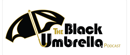


Designed for a Millennial-driven audience, the logo balances simplicity and character to ensure versatility across digital and print platforms, strengthening brand recognition and supporting marketing and engagement goals.

Clear Space: Preserving Logo Impact
To ensure the logo remains strong, recognizable, and user-friendly, a designated clear space is maintained around it at all times. This protective buffer prevents any text, graphics, or other elements from encroaching on the logo, preserving its visual integrity across digital, print, and experiential touchpoints. By defining and enforcing clear space, the brand achieves consistency, adaptability, and maximum impact in every layout and marketing application.


Seamless Progression: Designing for Growth
The work outlined above marks the beginning of an ongoing journey of design evolution and digital strategy. By grounding the brand in user-centered principles and culturally relevant insights, The Black Umbrella adapts as target audiences evolve—particularly Millennials, whose tastes and behaviors continue to shift. This ensures the brand remains relevant, engaging, and impactful across every touchpoint, from digital platforms to physical experiences.
Extending beyond logos and visuals, the brand’s identity was brought to life through tangible assets such as t-shirts, merchandise, and other wearable items. These designs translate the bold, unfiltered voice of the podcast into physical form, strengthening brand recognition, driving engagement, and creating a cohesive, user-centered experience across marketing channels and real-world interactions.
Project overview
Title: Logo Design & Branding Client: The Black Umbrella - Podcast
Industry: Social media, Podcast
Duration: December 2018
Role(s): Principle Designer, Content Creator, Graphics, Visual, Brand Designer
Tool(s): Figma, Adobe Creative Suite, Paper & Pencil, Keynote
bottom of page