top of page


i.am.You
Website (RWD) design
January 2023
In response to the impact of COVID-19 and social movements, schools increasingly incorporated social-emotional learning (SEL) into their curriculum to address discussions on racism and bias. To support this effort, I designed a responsive website that helps students navigate differences, explore perspectives, and build empathy. The design prioritizes accessibility, intuitive navigation, and engaging interactions, ensuring that children can easily engage with content that fosters awareness, reflection, and understanding.


Project Overview
I designed a responsive website aimed at helping children understand race, inclusivity, and bias. The project required balancing educational goals with engaging, age-appropriate experiences, ensuring that young users could learn without feeling lectured. The site needed to cater to a wide age range, from 5- to 10-year-olds, while maintaining a cohesive, intuitive design.
Challenges
-
Age and comprehension differences: Children process information differently at various ages. A 5-year-old requires simple, visually-driven content, while a 10-year-old can handle more complex narratives. Designing flexible content that accommodates these differences was key.
-
Representation without stereotypes: Illustrating diversity for children can inadvertently reinforce stereotypes. The design had to depict kids from all backgrounds in everyday scenarios authentically, avoiding tokenism while promoting inclusivity.
-
Engagement and attention: Young users have short attention spans, so the experience needed to be playful and interactive, making learning about sensitive topics accessible and engaging.
UX Design Approach
-
Created intuitive, age-appropriate navigation and interaction patterns.
-
Developed playful scenarios where kids make choices and explore different cultural perspectives, reinforcing learning through experience rather than lectures.
-
Created intuitive, age-appropriate navigation and interaction patterns.
-
Used consistent visual language and layout to maintain cohesion across varying content complexity and reading levels.
-
Ensured emotional connection and usability by integrating vibrant visuals, diverse characters, and interactive storytelling.
Overall the design approach needed to prioritize engagement, inclusivity, and emotional connection while ensuring usability for young users. Keeping the learning playful giving scenarios where kids make decisions and learn about different cultures.

An empathy-driven playful learning
To design a website that effectively teaches children about race, inclusivity, and bias, I began by developing detailed user personas representing a range of ages, reading levels, and cultural backgrounds. These personas helped define specific learning needs, comprehension abilities, and engagement preferences, ensuring that the design would resonate with each age group while maintaining a cohesive experience.
Next, I translated these personas into low-fidelity sketches, mapping out user flows and interactions for different age groups. These sketches allowed rapid experimentation with layout, navigation, and playful decision-based scenarios, ensuring children could engage with content intuitively. Iterating on these low-fi prototypes enabled testing and refinement of interactions that foster empathy and exploration, creating a responsive, inclusive, and engaging learning experience before advancing to higher-fidelity design.


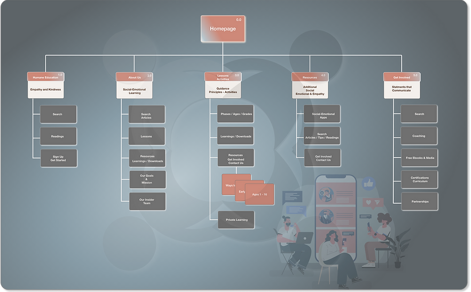
User Flow & Sketch Exploration
The user flows and sketches were central to defining an intuitive, engaging experience for children navigating complex topics like race and inclusivity. By visualizing step-by-step interactions, I could ensure that each touchpoint, whether a decision-based scenario, interactive lesson, or playful activity, supported learning goals while remaining age-appropriate and engaging.
Foundations of a Playful, Inclusive UX
-
Age-Appropriate Navigation: Different flows for 5- and 10-year-olds ensured content was digestible, with intuitive pathways tailored to comprehension levels.
-
Interactive Learning: Sketches explored playful decision-making scenarios that encourage active participation rather than passive reading.
-
Cultural Authenticity: Iterations focused on representing diverse characters in everyday scenarios to foster empathy without reinforcing stereotypes.
-
Visual Hierarchy & Accessibility: Layout and typography choices were tested in sketches to ensure readability and clarity across all content.
-
Iterative Refinement: Low-fidelity sketches allowed rapid testing and iteration of user flows before committing to high-fidelity designs.
These sketches and flows established a strong foundation for a responsive, inclusive, and engaging learning platform, aligning both UX and educational goals.
Our user flow diagram maps out intuitive interactions that guide learners seamlessly through playful, yet purpose-driven activities. This structured yet flexible approach ensures a smooth learning journey, helping individuals connect with different perspectives while developing problem-solving skills. Whether through storytelling, role-playing, or hands-on experiences, empathy-driven playful learning nurtures both cognitive and emotional growth, making education more impactful and memorable.
Wireframes and prototypes
By defining the workflow first, I was able to develop more detailed wireframes that align with the user needs, ensuring a structured and intuitive experience.
Low-fidelity wireframes were the first step in translating user research and personas into tangible design solutions. They allowed me to map out content hierarchy, navigation, and interaction patterns for children across different age groups. By testing layout, flow, and functionality early, I could identify potential usability issues and refine the design to ensure intuitive, age-appropriate experiences.
Building on the wireframes, interactive prototypes brought the concepts to life, enabling hands-on testing of decision-based scenarios and playful learning interactions. Prototyping allowed iterative adjustments to feedback from usability tests, ensuring that navigation, content, and interactive elements were engaging, accessible, and effective. This approach bridged the gap between concept and final design, creating a responsive, inclusive, and user-centered platform for exploring complex social topics.
Key User Experiences & Learning Pathways
-
Welcome & Onboarding: Guided introduction to the platform, helping children navigate the site and understand learning objectives.
-
Educational Stories & Lessons: Age-appropriate, interactive content designed to teach empathy, inclusivity, and social-emotional skills.
-
Gamified Learning & Activities: Engaging challenges and decision-based scenarios that encourage active participation and reinforce learning.
-
Self-Guided Exploration: Modules that allow children to navigate content at their own pace, fostering autonomy and curiosity.
-
Parent & Educator Dashboard: Tools for tracking progress, facilitating discussion, and supporting personalized learning experiences.
-
Accessibility & Support Features: Inclusive design ensuring content is readable, navigable, and engaging for all users, with additional resources for guidance.


To bring the concept together, I developed detailed wireframes and interactive prototypes using Photoshop and Figma, that focus on intuitive navigation and user engagement. These tools allowed me to craft visually compelling layouts while ensuring an intuitive and user-friendly experience. The wireframes served as the blueprint, outlining key interactions and guaranteeing a seamless learning flow.


Typography
Carefully selected typefaces ensure readability, hierarchy, and accessibility across age groups and devices. Typography guides users through content, enhancing comprehension and engagement while maintaining a consistent brand voice.
Button & Interactive Assets
Buttons and interactive elements are designed for clarity, affordance, and intuitive interaction. Their placement, size, and feedback mechanisms ensure users can easily navigate and engage with the platform, supporting a seamless and playful learning experience.
Color Palette
The color system is crafted to communicate hierarchy, emotion, and brand personality while supporting accessibility standards. Thoughtful contrast and consistent application create a visually cohesive experience that resonates with users and reinforces brand identity.
Discovery
The wireframes established the foundation for the project, mapping key interactions and user flows, while Figma’s prototyping capabilities enabled rapid testing and iteration. By integrating design thinking principles, we explored multiple solutions, gathering feedback early to uncover pain points and opportunities. Visual design remained a priority for the i.am.You campaign, ensuring that every detail, from layout to typography, supported an engaging, meaningful experience.


User testing revealed areas for improvement, including simplifying instructions, enhancing touch-friendly interactions, and ensuring diverse, authentic representation in avatars and storytelling. Accessibility testing further refined the design, incorporating features like voice narration, dyslexia-friendly fonts, and optimized color contrast. These insights informed the next iteration, resulting in a more intuitive, inclusive, and engaging experience that aligns with both user needs and campaign objectives.

Inclusive by Design
Designing for diverse audiences required an intentional focus on accessibility and inclusivity from the very beginning. Every decision, from navigation patterns to content hierarchy, was tested against the principle of usability for all. Clear messaging, intuitive pathways, and inclusive visuals were prioritized to ensure that users of different abilities, ages, and cultural backgrounds could engage with the experience seamlessly.
This approach reinforced the importance of equity in design, moving beyond aesthetics to create an interface that is both functional and meaningful. By embedding accessibility features and universal design principles, the product resonates with a broader community while maintaining consistency and clarity. These foundations will continue to guide future social good initiatives, ensuring that design solutions remain user-centered, inclusive, and impactful at scale.

Enhancing the User Journey
To deliver a seamless and engaging experience, the design process focused on refining the website’s core interactions and pathways. Navigation was restructured to be more intuitive, reducing cognitive load and ensuring that users of varying ages and abilities could easily find and engage with content. Interactive elements were redesigned to encourage exploration, turning learning into a playful and rewarding journey rather than a static experience.
-
Refined Navigation: Simplified pathways for intuitive exploration
-
Improved Engagement Elements: Interactive features that encourage play and discovery
-
Inclusive Design Choices: Visuals and layouts tailored for diverse audiences
-
Enhanced Accessibility: Voice support, color contrast, and responsive adjustments


The high-fidelity prototype focused on refining the details that shape a seamless user journey. Navigation and content structure were streamlined to reduce friction, while interactive elements were optimized for clarity and ease of use. Subtle, purposeful animations were introduced to support transitions, guiding users through the experience in a way that felt natural and engaging without overwhelming the core learning content.


.png)
To further enhance engagement, subtle animations were introduced to support transitions between screens and interactions. These micro-interactions added a sense of flow and responsiveness, guiding users without distracting from the core content. Together, these refinements elevated the prototype into a polished, user-centered experience that balanced clarity, usability, and delight.

Insights and Evolving Impact
By optimizing the website for engagement and ease of use, I uncovered the potential for digital platforms to create meaningful real-world change. This realization reinforced the importance of building adaptable, scalable solutions equipped with data-driven strategies to sustain long-term impact.
The i.am.You project highlighted the power of storytelling in shaping digital experiences. Through user research and community engagement, we discovered that people connect most deeply with authentic, relatable content. Moving forward, we aim to integrate more human-centered design strategies, leveraging real stories to spark meaningful interactions, build empathy, and inspire collective action.
Project overview
Title: i.am You, Social Impact Platform Client: Google Certification
Industry: Social Impact, Empathy-Driven Engagement Design (Kids)
Duration: November 25, 2022 - January 18, 2023
Role(s): Creative direction, UX/UI Design, Brand Systems
Tool(s): Adobe Creative Suite, Adobe XD, Paper & Pencil, Research, Testing & Iteration, Slack
bottom of page